Selected work
Product Design Case Study · Healthcare · Design Systems

VytlOne / Maxor

One platform. Multiple pharmacy brands. Three applications. One design system.

VytlOne brought multiple pharmacy experiences into a shared digital platform spanning desktop, mobile, and tablet. As the sole product designer and design-system owner, I was responsible for creating the experience architecture, reusable system, responsive interactions, and production-ready product designs that allowed the platform to scale without turning every pharmacy brand into a separate product.

Role

Senior / Lead Product Designer

Design Ownership

Sole Product Designer

Responsibilities

  • Product Strategy
  • UX Architecture
  • User Flows
  • Interaction Design
  • Responsive Product Design
  • Mobile Product Design
  • Tablet Product Design
  • Visual Design
  • Design System
  • Component Library
  • Accessibility
  • Prototyping
  • Engineering Collaboration
  • Production Validation

The primary application: the Desktop Retail Web Application, white-labeled for Apicha Community Health Center.

01 — The Problem

Multiple pharmacy experiences needed to become one scalable product system.

The platform needed to support pharmacy customers across multiple brands, devices, workflows, and operational contexts. The challenge was larger than redesigning individual screens.

Each pharmacy brand needed to retain its identity while the underlying experience needed to behave consistently. Desktop, mobile, and tablet experiences needed to feel related rather than designed as independent products.

At the same time, healthcare workflows required clarity, accessibility, reliability, and careful handling of complex information.
The Design Problem

How do you create one coherent product system that can support multiple pharmacy brands without forcing every brand to reinvent the experience?

02 — Sole Design Ownership

One designer. A platform-sized responsibility.

I was responsible for the product-design experience across the platform rather than owning one isolated feature. My responsibility extended from product structure and interaction decisions through visual design, reusable components, responsive behavior, prototypes, engineering collaboration, and production validation.

Sole designer. Shared product responsibility.

Sole ownership did not mean designing in isolation. I worked collaboratively with Product, Engineering, business stakeholders, and healthcare and pharmacy stakeholders throughout — but the product-design responsibility itself was mine.

03 — Making Sense of the Ecosystem

The first challenge was finding the system underneath the screens.

The product needed to support multiple pharmacy brands, different customer contexts, prescription workflows, account experiences, desktop, mobile, and tablet devices, reusable interaction patterns, healthcare accessibility requirements, and engineering implementation constraints. Instead of designing each experience independently, I looked for the shared structures, behaviors, and patterns that could become the foundation of the platform.

  1. Shared Experience Architecture

    The underlying structures, states, and interaction patterns common to every pharmacy brand on the platform.

  2. Design System

    Reusable components, tokens, and patterns built once and inherited everywhere.

  3. Brand Layer

    Client-variable tokens carry each pharmacy operator's identity without forking the underlying experience.

  4. Desktop / Mobile / Tablet

    The same architecture, expressed through the interaction model each device actually supports.

  5. Customer Experience

    What the pharmacy customer or patient actually sees, uses, and depends on.

04 — Building the Design System

One component library. Every client brand.

The design system was not a side project. It became the mechanism that allowed the product to scale. I established and evolved the design system as its owner.

Reusable Foundations

  • Typography
  • Color
  • Spacing
  • Layout
  • Forms
  • Navigation
  • Inputs
  • Buttons
  • Cards
  • Status
  • Feedback
  • States
  • Responsive Behavior
  • Accessibility
  • Interaction Patterns

The Product Decision

Separate experience behavior from brand expression.

Shared components and interaction patterns could remain consistent while brand-level styling could adapt the experience for different pharmacy clients.

  1. Foundations
  2. Components
  3. Patterns
  4. Brand Expression
  5. Product Experiences

Explore the System

This is not a recreation or a retrospective diagram. This is the actual design-system work used to shape the product.

Every component is built with client-variable tokens: font, color, and radius change per pharmacy brand, the component doesn't.

05 — From System to Product

A design system only matters if it improves the product.

Design-System DefinitionProduct WorkflowResponsive ImplementationProduction Experience

The design system was not a theoretical Figma library. It was used to build the actual product — the same components, tokens, and interaction patterns shown above appear directly in the desktop, mobile, and tablet applications that follow.

06 — The Primary Application

Designing the complete pharmacy experience.

The application needed to make pharmacy workflows understandable to customers without exposing unnecessary operational complexity.

Important Themes

  • Clear information hierarchy
  • Task-focused workflows
  • Prescription information
  • Account actions
  • Status communication
  • Error prevention
  • Responsive behavior
  • Accessible interaction
  • Consistency across workflows

Explore the Product Design

Inspect the actual desktop product design directly, rather than relying only on selected screenshots.

The account portal, white-labeled for Apicha Community Health Center: refills, transfers, and pharmacy locations.

07 — Responsive by Design

The same platform had to work everywhere.

Responsive design here was not a matter of resizing screens. Each device context changes what the experience needs to prioritize: available space, information priority, navigation, touch interaction, task sequencing, content density, feedback, and error handling.

Desktop

Full pharmacy experience with room for richer information architecture and parallel task visibility.

Mobile

Focused task execution with tighter prioritization and touch-first interaction.

Tablet

A middle context requiring both efficiency and clarity without simply reproducing desktop.

08 — Accessibility as a System Property

Accessibility belonged in the system, not at the end.

Because this was healthcare, accessibility and usability needed to influence reusable patterns rather than be applied as a final audit.

Addressed at the Component Level

  • Typography & Readability
  • Contrast
  • Focus Behavior
  • Keyboard Interaction
  • Touch Target Sizing
  • Forms & Labels
  • Error Communication
  • Status Communication
  • Semantic Structure
  • Responsive Behavior

When accessibility is addressed at the component and pattern level, individual product experiences inherit better behavior rather than forcing every screen to solve the same problem independently.

Accessibility scales when the system scales it.

09 — Product Decisions & Tradeoffs

Four tensions shaped nearly every product decision.

Consistency

vs.

Brand Flexibility

Every pharmacy brand needed to feel distinct to its own customers, while the underlying experience needed to behave the same way regardless of which brand a customer was using.

Resolution

Standardize behavior and reusable interaction patterns while allowing controlled brand expression.

Power

vs.

Patient Simplicity

The platform needed to support complex pharmacy operations, transfers, and account management, but a patient managing a refill shouldn't have to understand any of that complexity to complete a simple task.

Resolution

Keep operational complexity behind the experience wherever possible and expose only the information and decisions customers need.

Desktop Depth

vs.

Mobile Focus

Desktop had room for parallel information and deeper account management. Mobile needed to get a specific task done quickly, on a much smaller surface.

Resolution

Preserve the task and information hierarchy rather than forcing identical layouts across devices.

Speed

vs.

System Quality

New client brands and features needed to ship quickly, but speed that fragmented the design system would have made every future feature slower to build.

Resolution

Use reusable components and patterns to increase delivery speed without allowing individual features to fragment the experience.

10 — One Click Refill

Making an important pharmacy task feel simple.

Patient Simplicity

vs.

Operational Requirements

A customer should not have to understand the internal complexity of a pharmacy system simply because the system needs that complexity to operate.

Resolution

Progressive disclosure, sensible defaults, and clear hierarchy reduced unnecessary cognitive load in the refill flow, so a customer who already knows they need a refill can complete it in as few steps as possible.

A customer who already knows they need a refill gets it in as few steps as possible.

11 — From Design to Production

The work did not stop at handoff.

I remained involved through engineering collaboration, implementation review, design QA, responsive validation, accessibility review, and continued evolution of the design system.

Implementation constraints sometimes required design adjustments, but the goal was to preserve the user outcome rather than defend a static mockup.

  1. Product Need

    A workflow, task, or brand requirement enters the platform.

  2. Design

    The experience and interaction model are defined against the shared architecture.

  3. System

    New patterns are built into or reconciled with the design system rather than designed as one-offs.

  4. Engineering

    Implementation surfaces real technical and platform constraints.

  5. Validation

    Design QA, responsive validation, and accessibility review confirm the built experience.

  6. Iteration

    The experience and the system evolve together as the platform grows.

12 — Measurable Outcomes

Three years. Measurable outcomes.

1.0 → 4.7 Stars
Application rating improvement across patient and pharmacy-facing surfaces.
$2.5M Estimated
Development cost avoidance through reusable design patterns.
3+ Years
Sole ownership of design across the platform.
WCAG 2.1 AA
Accessibility built into every component, every brand.

These figures describe the platform-wide transformation across three years, not outcomes attributable to any single feature such as One Click Refill. Individual features contributed to the experience; the metrics reflect the system as a whole.

13 — What I Personally Owned

End-to-end product design ownership.

Product Design Strategy
UX Architecture
User Flows
Interaction Design
Responsive Design
Mobile Design
Tablet Design
Visual Design
Design System Strategy
Design System Ownership
Component Library
Accessibility Patterns
Prototyping
Design Specifications
Engineering Collaboration
Implementation Validation
Design QA
System Evolution

I was the sole product designer and design-system owner, but the product itself was built collaboratively with Product, Engineering, business stakeholders, and the broader organization.

14 — Outcome & Learning

The real product was the system behind the screens.

The work resulted in more than a collection of desktop, mobile, and tablet interfaces. The shared architecture and design system created a foundation that allowed the product to remain coherent across pharmacy brands, workflows, and devices.

The goal wasn’t to design every screen the same. It was to make every experience feel like it belonged to the same system.

The project reinforced that a successful design system is not measured by the number of components in a library. It is measured by whether teams can use it to create better, more consistent products without working around it.

Continue Exploring

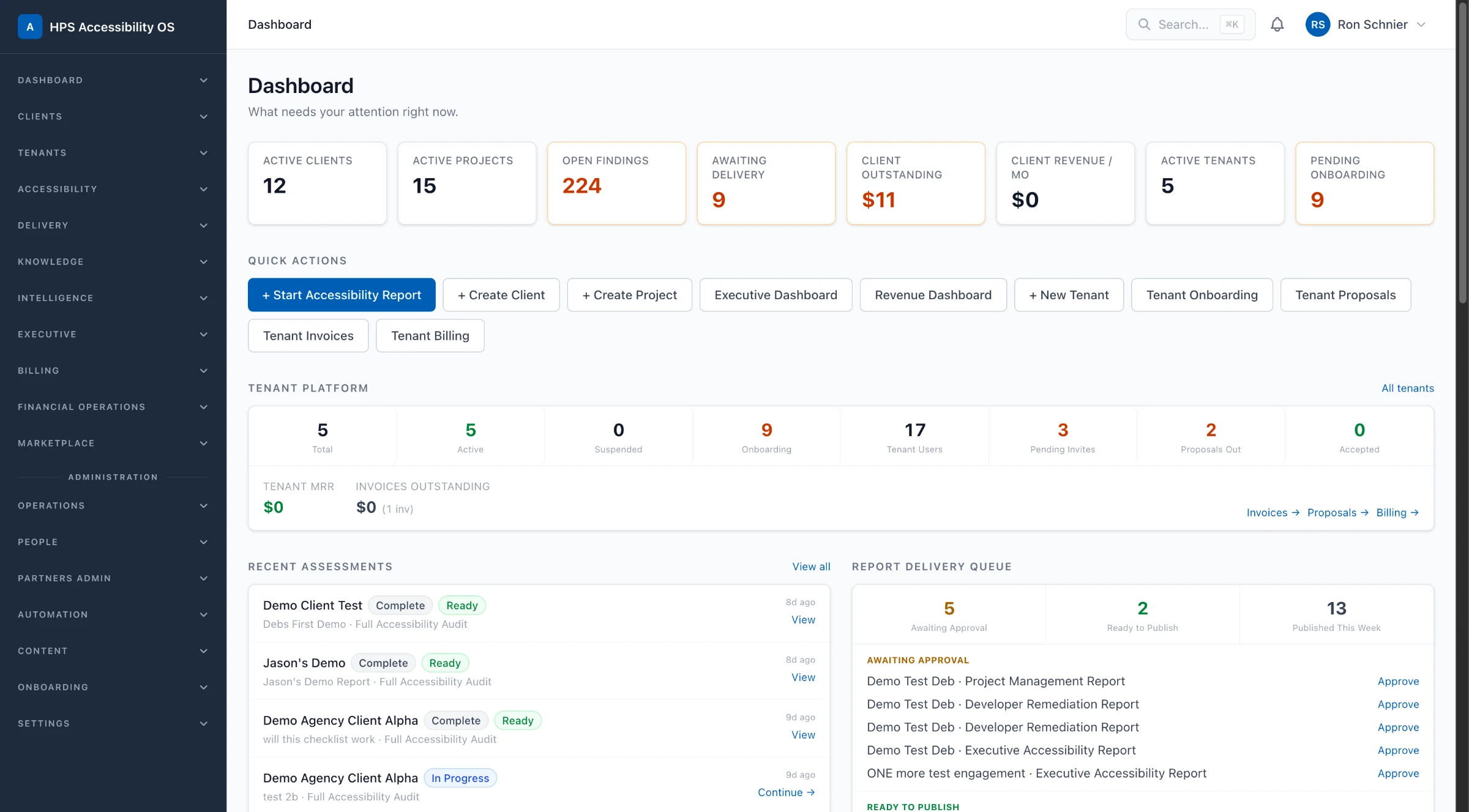
Another system where accessibility was built into the pattern library.

HPS Accessibility

An Accessibility Operations Platform for managing accessibility work from assessment through delivery.

Another platform where accessibility lived in the underlying pattern library rather than a final audit, the same system-level approach applied here.

  • WCAG 2.2
  • Section 508
  • Design Systems